


Visualize Legal Data on Demand in :Harvey:
You can now take unstructured legal inputs and build interactive timelines, entity charts, compliance matrices, and dashboards directly in Harvey.
Legal work is built on complex data: webs of entities, sequences of events, regulatory requirements across jurisdictions. It takes significant time to extract patterns from that data, and it can take just as long to communicate those patterns to partners, clients, or business teams.
Until now, that meant exporting data, building visualizations in different tools, and maintaining outputs separately from the data itself. Now with Harvey, you can generate interactive timelines, entity charts, compliance matrices, and dashboards directly in the platform, turning inputs into visuals your stakeholders can explore, present, and share.
Here are five ways lawyers are using it today:
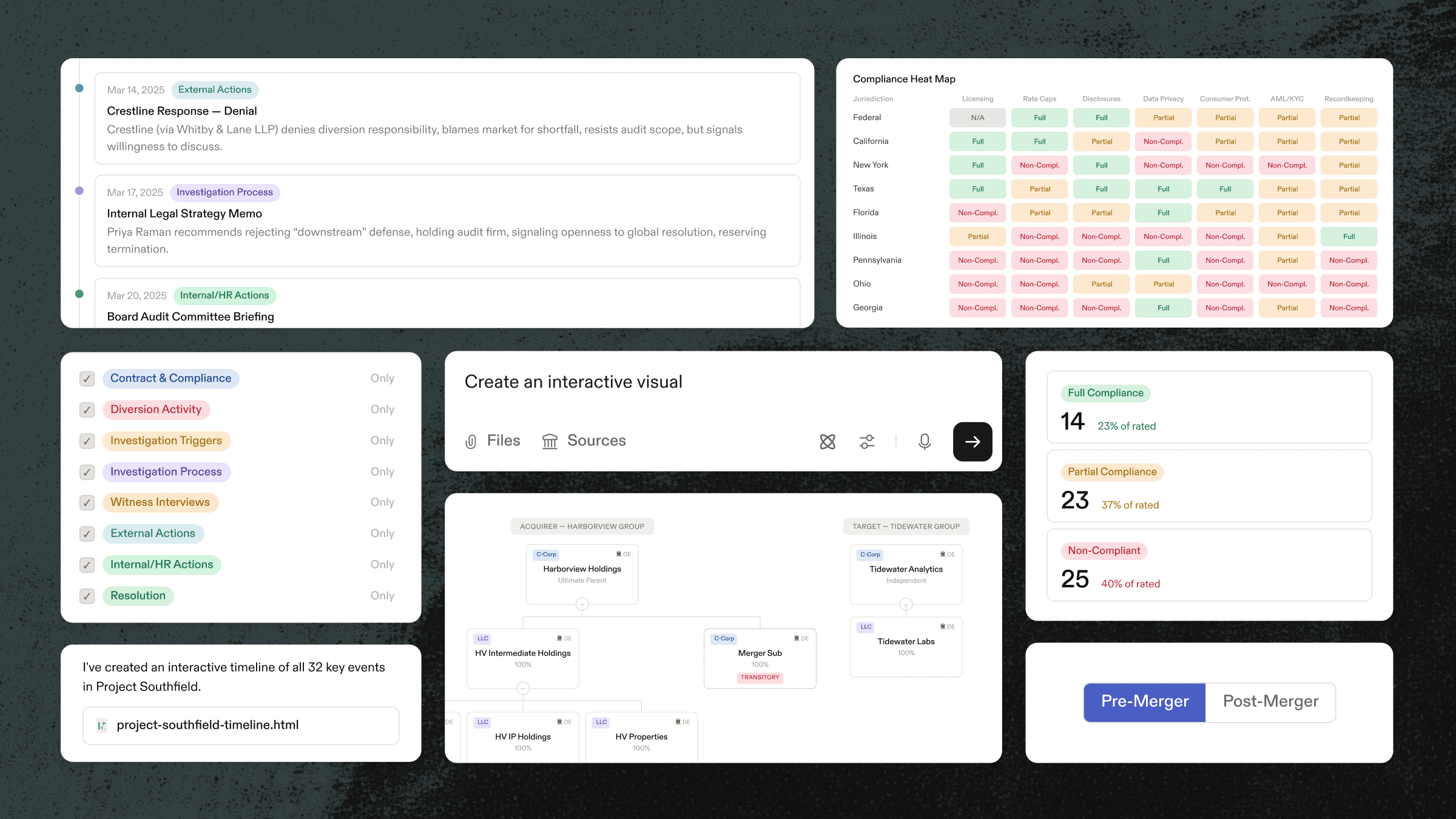
Example 1: Map Pre- and Post-Closing Corporate Structures in M&A

Acquisition structures are rarely simple: holding companies sit above intermediate entities, operating subsidiaries own downstream IP and services companies, and the target may bring its own layered cap table. With Harvey, deal teams can turn organizational documents, formation certificates, and merger agreements into an interactive structure chart that compares the pre-closing and post-closing states. The result is a single view of entities, ownership percentages, and structural changes that teams can use to understand the transaction faster.
Example 2: Surface Relationships Between Key Witnesses and Entities
Trial preparation depends on understanding how people, entities, and events connect, but those relationships are buried across dense case files. Harvey can turn that case file into an interactive chart: connecting witnesses, corporate parties, and the timeline of key events to provide the team a clearer view that drives case strategy, partner reviews, and client conversations.
Example 3: Create an Investigation Timeline From Case Materials

Compliance reports, interview notes, internal memos, and emails all mark part of an investigation story, but when that information is spread across hundreds of documents and months of activity, it’s challenging to piece it all together. Harvey assembles those pieces into an interactive timeline, plotting key events from the first anomaly through investigation steps, audit demands, counsel responses, through to settlement discussions. Each event can be explored, filtered, and presented to the board or outside counsel without rebuilding the chronology by hand.
Example 4: Visualize Financial Flows in an Investigation
Internal investigations and enforcement matters often require tracing funds across accounts, entities, and time periods. Instead of reviewing transaction records, bank statements, and internal reports in isolation, teams can use Harvey to visualize the movement of funds across parties and accounts, making it easier to spot anomalies, prepare for interviews, and present findings to counsel or regulators.
Example 5: Build a Compliance Dashboard Across Jurisdictions

For in-house teams, assessing regulatory exposure requires navigating dense statutory material, internal policies, and jurisdiction-specific requirements. Harvey turns those sources into a compliance dashboard that compares licensing, rate caps, disclosures, data privacy, recordkeeping, and other obligations across state and federal regimes. Teams can filter by jurisdiction, category, or risk level and quickly see where they are compliant, partially compliant, or exposed.
Try it Yourself
Every interactive output can be downloaded as a shareable .html file, no extra tools needed, and ready to share with a partner, a client, or other teammate.
The hardest part of legal work often isn’t the analysis; it’s making the analysis understandable to the people who need to act on it. Harvey now handles both.


